Hey guys, this is Aziz, and this is my debut post on the blog. I hope you guys enjoy it!

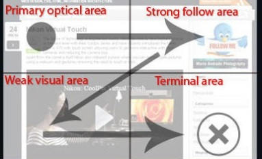
If you’ve ever had the chance to check out the ads running on POF, I’m sure you’ve noticed that 99% of the ads you see have the typical image-on-the-left, copy-on-the-right placement. Why is this the case? This widespread phenomenon in creative layout is molded by 2 commonly accepted principles in the marketing industry. The first is called the Gutenberg Rule, which states that when people scan a page of content, they scan left-to-right and top-to-bottom, making the top left area the focal starting point. The primary optical area is where the content needs to convince the viewer that what they are about to read or click on is going to be worth their while.
Along with the Gutenberg Rule, experienced marketers will tell you that a successful creative weighs largely on the effectiveness of your image to attract attention (50-80%), followed by your headline (10-30%), and lastly your body copy (5-10%). Simply put, according to studies, an ad will get more clicks when it includes a powerful image, placed on the left of your banner since it is the most effective when used in the primary optical area in order to get the viewer to invest more time in the creative.
In an endless sea of left-justified image placements in creatives, I started wondering what would happen if a few images defied tradition. So I decided to take that idea and make it into a POF case study with our little friend, the 310×110. First, I grabbed a batch of images that performed well in a previous campaign that targeted women age 18-21. Preserving the same targeting, I set up 3 templates: one with an image on the left, one with an image on the right, and one with 3 images across the banner. Finally, I ran the ads until each creative had at least 10,000 impressions and kept the top 2 performers from each template.
Case Study Creatives

The Results
It seems that contrary to widespread usage, left-justified image placement didn’t always produce the best CTR. We were actually pretty surprised at the clear divide in this case study. Images placed on the left performed the worst, while the images on the right got a slightly better CTR, leaving the 3-image placement as the victor.
Keep in mind that the above creatives were targeted toward one specific demographic and had collected less than 15,000 impressions each. Across data greater sample size and wider range of demographics, the results could certainly vary. What we can learn from this little case study is to never stop challenging the norm and thinking outside the box. While I still believe that the aforementioned principles hold, much of marketing is about differentiation and standing out from the crowd to catch the attention of the traffic that suffers from technology ADHD.
What are commonly accepted principles are rooted in logic and are time tested, but the magnitude of potency depends on many factors. In the world of POF, the principle of left-justified images suffers from overuse, which is especially noticeable in POF small ads that are shown 3 at a time side-by-side.
While the advertising industry seems to accept that left-justified image placement is always the most effective, I took the “test for yourself” mentality, and I urge you to step back and do the same wherever you’re advertising.
We used 310x110s here, but what would be interesting would be to see how mimicking 110x80s but testing image placement (left vs. right vs. middle) would fare in a similar case study.
If you’ve tested image placement or went against the grain another way, please share your results with us!
Leave a Reply