With as much experience as we’ve had in POF, there are still a lot of questions we have yet to answer and a vast more that we haven’t even thought to ask.
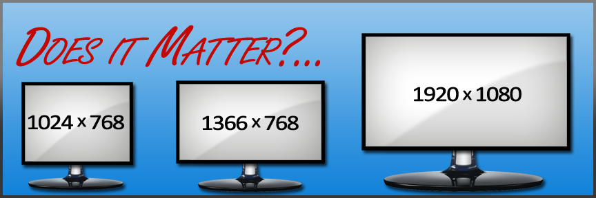
That said, recently we decided to tackle one question that’s been in the back of our heads for a little while regarding landing page performance and landing page display resolution.
The Big Question
With all of the various screen sizes that exist in the world today, we wanted to find out which display dimensions we should use to create our landing pages to best cater to our POF demographic.
So to find that out, we had to ask ourselves: does display resolution affect landing page performance?.
Our Preparation
With that question in mind, and a set budget of $500, we started to prepare our test. After a little bit of research, we found a list of the most popular resolutions used in the US.
Taking that list, we found 3 resolutions we decided to use
- 1024×768 – “Low-Resolution”
- 1366×768 – “Mid-Resolution”
- 1920×1080 – “High-Resolution”
Finding Our Landing Page
Before we could test the various resolutions we wanted to start out with a landing page that performed well, but that we hadn’t used before.
Immediately, we began testing numerous landing pages each varying in design and complexity until we had a steady landing page click-thru of 40%.
Since we only cared about how visually alluring the landing page was, we didn’t want to concern ourselves with any other performance metrics like conversion rate or creative CTR.
Below was our resulting layout:

Live versions:
Low-Res | Mid-Res | High-Res
Campaign Targeting
Once we found our landing page, we then took that design and layout and applied it to our top 3 resolutions as seen in the links above. Each landing page was separated into 3 campaigns all targeting US males ages 30-39 with a login count of <50 which helped us keep everything properly organized.
Setting The Rules
The most important thing about any test is to abide by a strict set of rules.
Our rules were simple:
- Use The Same Creatives for each landing page. While we desired the lowest possible cpc, we felt that interfering with the creatives process would skew data. If one campaign needed more creatives, the other two got the same creatives injected as well.
- Stagger Each Campaign’s Bid by just $0.01 each to maintain placement fairness.
- Rotating Bids between the three campaigns each day. This was an attempt to lower the influence of placement on performance as much as possible while preventing two of the same creative appearing at once
- Only Running During The Day to keep an eye on creative performance.
And The Winner Is…
After we spent our budget $500 to find and test our landing pages, we felt we had enough data to draw some conclusions. Before we break down our findings, let’s take a broad look at what we found:
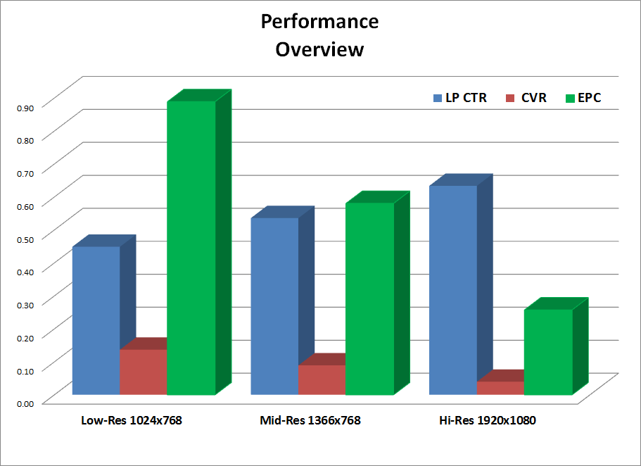
At first glance this may seem a little jumbled, so I’d like to provide the important metrics individually.
CTR (Click-Thru Rate)
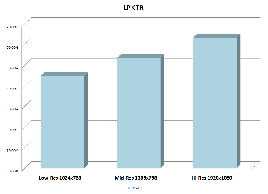 The primary focus of these landing pages’ performance was on the landing page CTR. As you can see in the graph above, the landing page catered to the largest display resolution had the highest CTR. While we can only speculate as to why it got more clicks, we have our suspicions.
CVR (Conversion Rate)
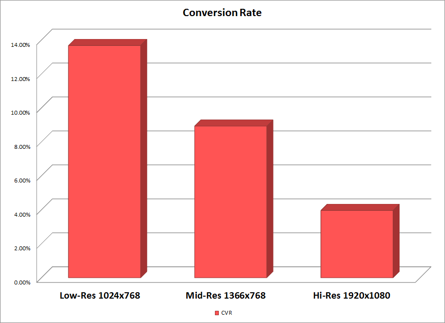 Oddly enough, while the high-resolution landing page yielded the best CTR, it also got the worst conversion rate at just 3.96%. Since we only used this one design for this resolution, we can’t know why users clicked to go on to the offer but failed to act. Historical data has shown us that a high click-thru and low conversion rate is mostly due to misleading images or copy, but since the other landing pages had the same content, that doesn’t seem to apply here.
Profit/Loss
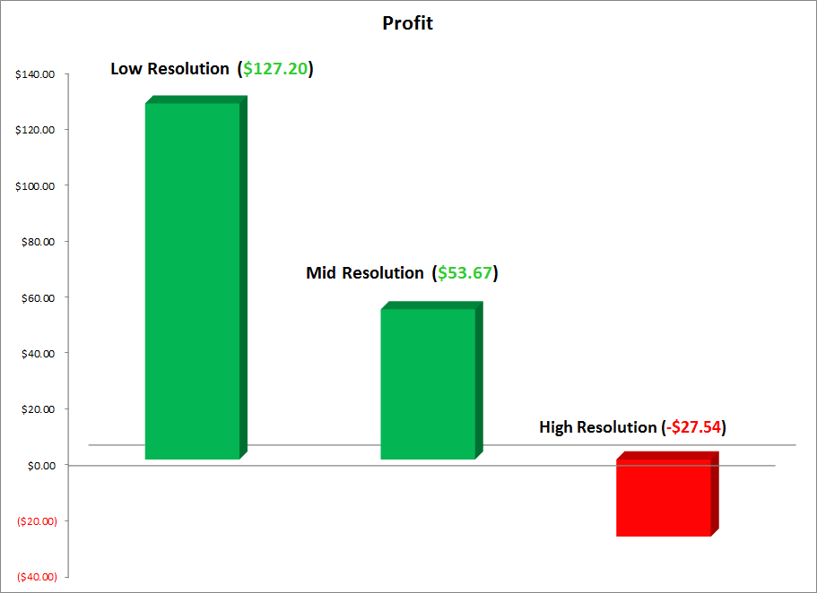 Lastly, for those curious about how much the resolution affected our ROI, to the left is a graph which shows how profitable each landing page resolution was. Although the low-resolution landing page had the lowest CTR, with it’s greater CVR, it was the most profitable with $127.40 in profit. The opposite could be said for the high-resolution page which actually lost $27.54 in total.
Conclusions
Taking into consideration the larger images, if users with a smaller screen saw the high-resolution landing page, they might see mostly a set of images scrolling down their screen, thus placing all of the focus on images and not on copy. But if users aren’t seeing our copy, we’re missing out on an opportunity to convince them to act in our favor. This may explain the high CTR but low CVR for the high-resolution page.
Also notice how our landing page is a little wordy; users are more likely to be able to read all of our copy in the low-resolution so that when they clicked to the offer, they had a higher intention of signing up.
Last Words
We can speculate all day as to why one page performed well over the other; but without further testing, we won’t know. What we do know is that the smaller display resolution performed the top 2 most popular by a large margin. Ultimately, take the above data into consideration when you’re designing your next landing page to truly get the best out of your landing pages.
Excellent case study as always.. One thing that can be done, is put use CSS to resize the landing page according to the viewer’s resolution.. This way, everybody is happy.. Thanks for sharing Aziz!
You aren’t taking into consideration the demographic of the people that purchase the 3 monitor sizes. Think about all the people you know with 1920×1200 resolution monitors. They tend to be more tech savvy than the rest of the general population with 1024×768. Being more tech savvy, means they’ll always convert less with online advertisement than most other demos.
To test this, simply look at your web analytic software, and do a resolution comparison versus conversion, and you’ll notice the exact same thing. Not really a big surprise. Tech savvy people can spot ads better, understand how people monetize websites better, and generally avoid being sold online better.
This is Marketing 101 -> Market Research -> Customer Profile -> Tech Savviness.
– CCarter @ WickedFire
Thanks for the analysis Chris. Logic-wise, I do agree that the tech-savvy people are less likely to convert, as indicated by difficulties advertising on places like Reddit. However, there’s only 1 thing that doesn’t seem to add up, maybe you could shed some light on. Let’s assume the larger resolutions belong to tech savvy people, and those are the ones who convert less with online ads, but then it’s unclear why they would click on the ads in the first place unless 1) our ads were very good or 2) they didn’t think they were ads. I think you could very well be right, and based on logic I would absolutely agree, but the correlation isn’t 100% conclusive for me to say for sure that tech-savvy = high screen resolution. Interesting discussion!
They wanted to see what was on the other side.
I click on Advertisements all day, but I know as soon as I see a sign-up form, I know I’m probably going to get charged monthly re-bill or something, and would rather not. If it was a free offer or something, I might sign up, but as soon as you ask for personal information. I put my guard up all day, and am less likely to pull out a credit card.
That doesn’t mean, I’m less likely not to click thru and look at whats on the others side. It might be something interesting after all.
There is also another reason, The Advertisement itself might look good, but the end page where it converts is not “Savvy” enough for the tech-savvy person, and that’s turning them off.
Example, I go to Best Buy’s website, I expect a certain amount of tech savviness to the site. I go to some mom and pop computer store, I don’t have the same expectations, most likely, I will not bother ordering online from that mom and pop store, and might just go to amazon cause I know the dangers of PCI compliance, Identity Theft, or malware, etc.
So, the “TRUST” for a more tech savvy individual has a higher barrier than a low tech individual.
“You can’t sell a person used to Bentleys the same way you sell a person used to Hondas.”
– CCarter / Wickedfire
Chris, here’s some demographic data harvested from the case study you might find interesting.
Out of the people who were sent to the high resolution LP:
13.8% was aged 18-30 and 86.2% was 30+
76.7% of people did not have at least a bachelor’s degree, while 23.3% had a bachelor’s or higher.
54.3% made less than $50K income and 45.7% more than $50K
Nice data. Older crowd, upto high school and not above, income is a little statistically inconsequential since it’s pretty close in my opinion.
Unfortunately, that data doesn’t determine whether they are tech savvy or not. Income level is not a good marker for that. For example if you look at the “low income” population of the nation, you’ll notice most of them have some of the most advanced technologies (iphones, ipads, etc). In fact, the lower income, the more willing they are to buy luxury items for some reason. But that’s besides the point.
The education level is also not going to determine if they are tech savvy, it’s a good indicator for the next generation coming up, but for an older crowd, 30+, they didn’t go to school (middle, high school, then college) using the technologies of today.
The definition of tech savvy is not really defined by income bracket, college education, or age. It’s really an understanding of how to use technologies and the length of time they’ve used the internet. That’ can’t be measured with the data you’ve provided. I know college educated 40+ year olds that can’t send email and fall for every popup that comes along. I also know college age kids that do the same. If there was a way to measure the amount of time they’ve spent on the internet (in years) or their understanding of internet technology, then you can determine if it’s a tech savvy problem, or we’re simply wasting time talking about the wrong set of metrics to analyze.
Assuming we are right thinking about the “tech savvy” theory; Here is an excerpt I wrote on Wickedfire about this:
“Tech Savvy individuals may need a more tech savvy landing page to convert, whereas Low tech individuals will convert on pages that are not as tech savvy.
The best scenario is to have 3 different landing pages, EACH are split tested for their resolution. Meaning, you a/b split test landing pages for low tech individuals. Then when a person with a low tech profile comes to the website, they’ll get the best optimized landing page for them.
Then you a/b split test high tech landing pages and display them to high tech individuals when they arrive at the site.
It’s like mobile advertisement versus Desktop. The type of platform they come to the site with has to also be optimized and split tested individually in a vacuum. Just because this landing pages works on low-tech does mean it’s going to be even in the running for hi-tech individuals, etc.” [ End Excerpt ]
Basically, we can make our heads spin trying to determine what’s what. If It were up to me, I would test different landing pages according to the platform (desktop versus mobile), operating system (Mac versus Windows), and resolution (you know the numbers), and if possible test by region.
I would create as many segments as possible – which will eventually border on impossible at some point, LOL. But if possible and I’ve done tests, and know that a MAC OSX user with 1920×1200 resolution is going to convert 15% higher if they see landing page 21A versus anything else, I’d want that type of data.
For now though, the vast majority of online websites don’t even go to the level you’ve gotten, so it’s safe to say, this is more data that 90% of what the competition has. Also, it might be, that we are thinking way too much into this, and the landing pages just looks bad at 1920×1200 resolution. I mean, If I was looking at that landing page, I would expect better usage of spacing, it looks like it’s just stretched out, so it might be that it just looks like crap at that resolution.
I’m curious, did you try looking at the offer page in those resolutions as well. It’s possible that the page looked horrible on a higher resolution screen, such as being scrunched to the left hand side.
Great question, Brett. The while the offer page didn’t really have a responsive layout, in all 3 resolutions the main parts of the LP (headline, strapline, image, CTA, urgency, interactive components, callout, social proof) were all visible, legible, and centered.