One question you should always ask yourself before creating any banner, is whether or not your goal is to create awareness of the brand you’re advertising, or if you’re trying to get a user to act immediately.
As a performance marketer, creating brand awareness does not help put food on the table. Remember this rule: Unless you’re promoting your own product, you should never concern yourself with creating an awareness of any service or product you’re advertising.
Below are some mistakes you should avoid and some ways you can avoid them.
Professional-Grade Appearance
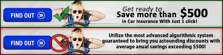
 It happens all too often; you’ve come up with a “million dollar” idea that you feel deserves a “million dollar” design that would rival Coca-Cola or Doritos. So you fire up Photoshop and get to work.
The problem is, you spend all that time adding shadows, gradients, shapes, and shine effects to your ad, but your message still falls on deaf ears because while your ad may look really good, it just looks too good.
When your an ad looks like it could belong to a multi-million-dollar company, an almost subconscious red flag appears which screams “someone is trying to sell me something”. What typically follows is contempt and in most cases, inaction.
Pro-grade performance marketers know that pro-grade ads will almost always fail. Leave your designer’s jacket at the door and stop wasting time with photoshop’s vast library of effects. Remember, the more amateur, the better.
Vague Benefits
People are by nature selfish creatures. Your users’ primary concern is whether or not your product can make their life any better.
Don’t beat around the bush when telling your users just how much your product or service can benefit them.
If your offer will save them money, give them an average reported savings. If your offer can get them quicker results, give them an exact time frame. Just remember to tell them how quickly they will benefit from your product, in which way, and to what degree.
Long-Winded Copy
When you have a lot to say, you want to say it all. Sometimes we take a long time to say what we want to say because we’re trying to be thorough. Other times our ego drives us to sound smart so we use large words. Whatever the cause, a lot of marketers have an amazing angle, but just can’t seem to spit it out.
The problem here is that users want quick and to the point. The average attention span last just 8 seconds. If in that time you haven’t conveyed your message, they’ll move on to the next attention-grabbing item they see. It’s important to remember to use short, concise, simple, yet descriptive words when expressing your angle.
Using the 20% rule, I like to zoom out my creative until it’s scaled to 20% of it’s normal size. From there, I can tell if there are too many words (which may make my ad look congested and hard to read) or if there’s not enough contrast (which could make my copy and image blend into the background).
Lack of Urgency
Whether or not space is limited, resources are scarce, or membership is reserved, if you’re not conveying to your users that what they’re being offered may never be offered again, they may not feel compelled to act immediately. When you leave time for your users to weigh their options, you’re leaving room for them to just act later. This is fine if you’re a brand looking for eventual customers, but as a performance marketer, you want that user to feel like an action later will result in a missed opportunity.
Mixed Signals
Sometimes marketers try to cover all of the bases when they’re looking for images for their angles. But the wrong image and color-scheme can dilute and mix up your message.
Without diving too far into color-psychology, dark colors along with red, yellow, and orange typically provoke a sense of aggression, anxiety, and sometimes deviant behavior. Bright colors provoke happiness, relief, and wholesomeness.
Blended Colors and Elements
 Every performing ad has 4 components: the image, the headline, the body copy, and the call to action. Depending on the size of the ad, you may find it difficult to distinguish your elements from one another and the background itself.
When creating an ad, it’s important to use contrasting colors for your text, images, and background. If your ad looks like a blurry blob, users will likely pass over your ad; and in the event that they stop to read your ad, they may find it too difficult to read and miss your message.
One way I like to make my text and images stand out from the background and from one another is by opening up my images in Photoshop and adjusting the contrast layer there. I also like to use Kuler’s color tool which helps me find contrasting colors for my ads.
Unclear Call to Action
Sometimes using a clever call to action might seem like a good idea, but where there is a vague set of instructions, users are less likely to act in your favor.
Don’t leave anything up to chance when providing an offer to your users. You’ve attracted their attention and created compelling copy, don’t let that go to waste. The best way to avoid inaction is to provide clear-simple instructions on what it is they need to do to “make their life better”.
Wow! Very helpful article. Short but full of gems! I now have plenty of ideas to “adjust” my ads. Thanks!
Great post Tom. I believe the link to Kuler’s color tool is broken FYI.
I’m really not convinced about your Professional-Grade Appearance argumentation. All in all a great article, but the image examples of this topic look like a porn ad.. and you are basically telling that all the big companies do it wrong by making it look professional. Maybe there is some deeper understanding of reactance and similar principles needed