There are a number of ways that you can design your landing pages to quickly and succinctly convey value to your landing page visitors. However, finding the balance between sufficient information and efficient use of page space can be difficult without proper design or know-how.
The Problem
Provide too much information at once, and you may overwhelm your visitors but provide too little and you may not be able to fully persuade your visitors to act.
This can be an issue for anyone. But how can you get around it?
Solution #1: Popovers
 These two techniques are a great way to provide a lot of information in a small window and at a pace that the user is easier for the visitor to take in all while simultaneously allowing users to interact with your landing page and making your content more engaging. But enough about how these techniques can help you, let’s learn how to create them.
What You’ll Need:
Both Popovers and Carousels are part of Bootstrap by Twitter‘s framework. You can download the files from the Twitter Bootstrap Download Page and link to the following files for both techniques to work properly:
- bootstrap-responsive.min.css
- bootstrap.min.css
- bootstrap.min.js
Additionally, you’ll need a recent version of jQuery (at least v1.7.0).
What’s a Popover?
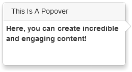
Some of you may be wondering by this point, “What is a popover?”. Well, a popover is a small bubble of content that appears adjacent to another element which can be triggered when the visitor either clicks on an element (like a button or image) or simply moves their mouse over an element.
click the following link to see popovers in action.
Now that you’ve seen what basic popovers are capable of, let’s take a look at how to create one.
Popover Code
As you can see, this is pretty basic. Still, I think it would be a good idea to break things down real quick:
- data-placement= – This option declares that the popover will appear above the element it’s designated to. Other positions are bottom,left, and right.
- data-content= – As you may have guessed, this is where you can control what appears in the content area of a popover.
- data-original-title= – Here you can set the title of your popover; as indicated with the gray background. Note: to remove the grey title area, just leave the data-original-title= option blank
- data-trigger= – You can determine the event which will activate the popover with this option. The default setting is click but when set to hover will activate when the user moves their mouse over the designated area.
- data-toggle= – Lastly, this option declares that this is a popover event and will allow everything to operate properly.
There are additional settings can be found at the popover section of bootstrap.
Once you’ve set the options of your popover, you’ll need to paste in some javascript to activate the popover, like so:
Adding HTML Elements
Lastly, you can add HTML elements to your popovers in one of two ways. Either with data-html=” “ (and setting it to “true”) or with a bit of javascript. Both are simple to implement, but since the former is pretty explanatory, we’ll just go over the javascript method.
First, your javascript:
$(document).ready(function(){
$(‘.info_1’).popover({
html : true,
content: function() {
return $(‘#info_1’).html();
}
});
});
With the above code, we’re saying that whenever our specified event (a click or mouse hover) occurs in any “info_1” class elements, then the popover will show and contain whatever we have within our info_1 id element.
Of course, this means that you would need some content within an info_1 id tag on your landing page which you would create just like any other element but make sure to use the visibility:hidden attribute.
Expansive Possibilities
It may take some time to tweak the CSS of the popover content so that it appears exactly to your liking, but ultimately, this is a powerful plugin. With this plugin alone, you’ll be able to create landing pages with a more legitimate appearance.
You can add popovers with testimonials and increase the amount of social proof or provide additional unique selling points to elements within your landing pages; all without hitting your visitor with a bunch of information and while further engaging your visitors.
Additionally, popovers work incredibly well with other plugins, like for instance Bootstrap’s Carousel plugin. When combining these two techniques, we can create even more engaging content without taking up a large amount of your visitor’s browser window. To find out how to do just that, stay tuned for Part 2, coming soon!
[…] video marketing strategy | Powerful YouTube video marketing software […]
[…] Part 1 of this tutorial series, we illustrated how you can create popovers to make the content in your […]